about
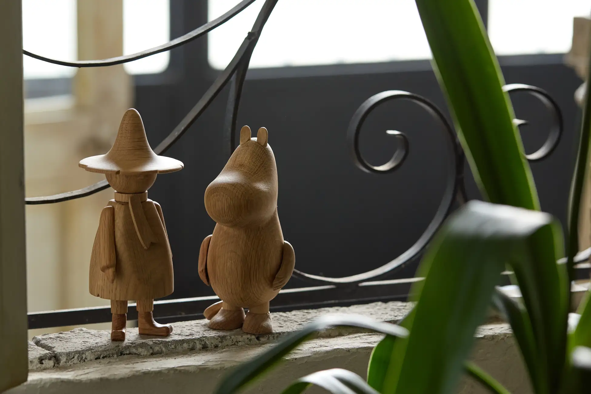
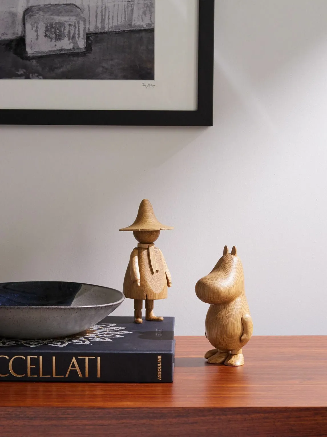
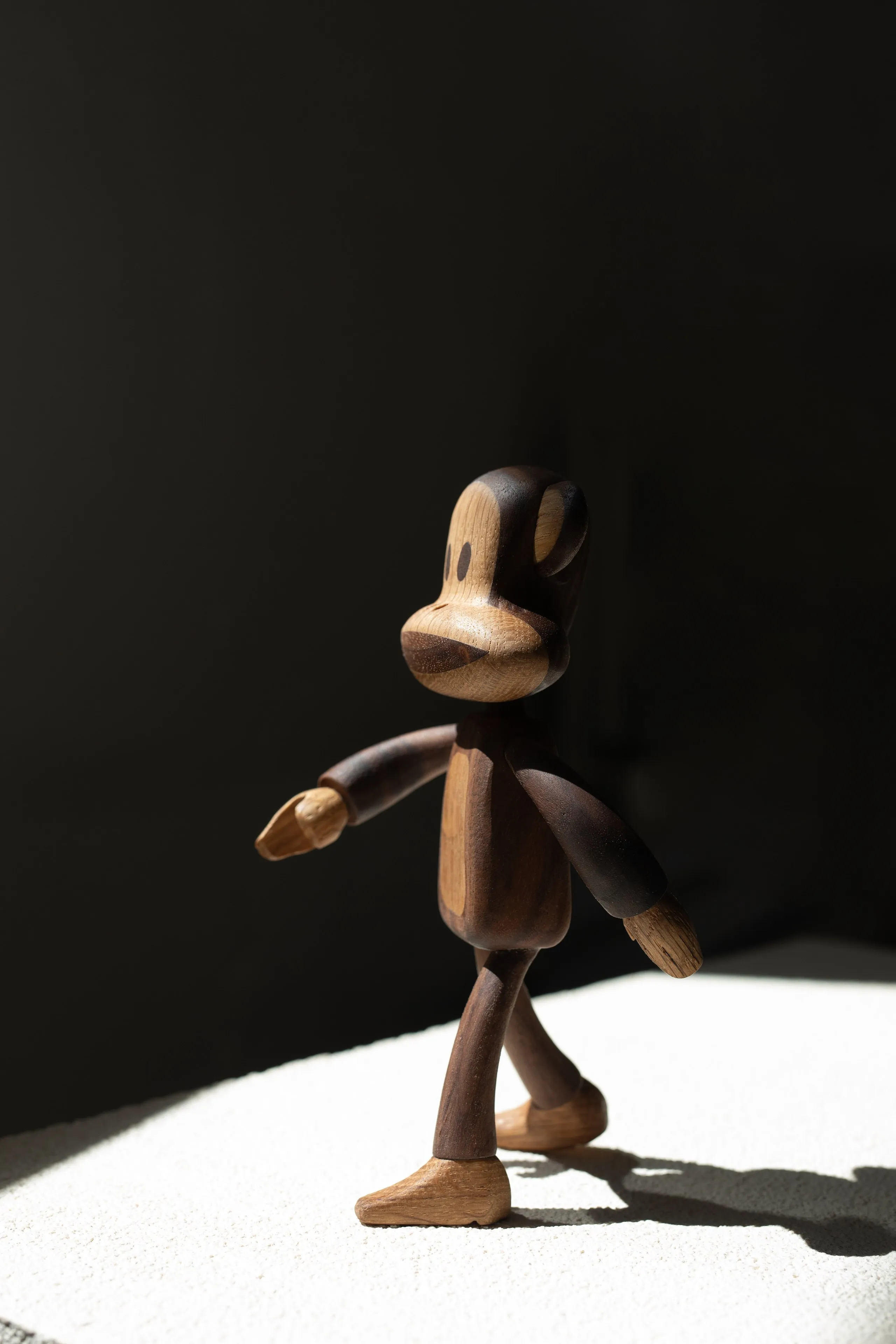
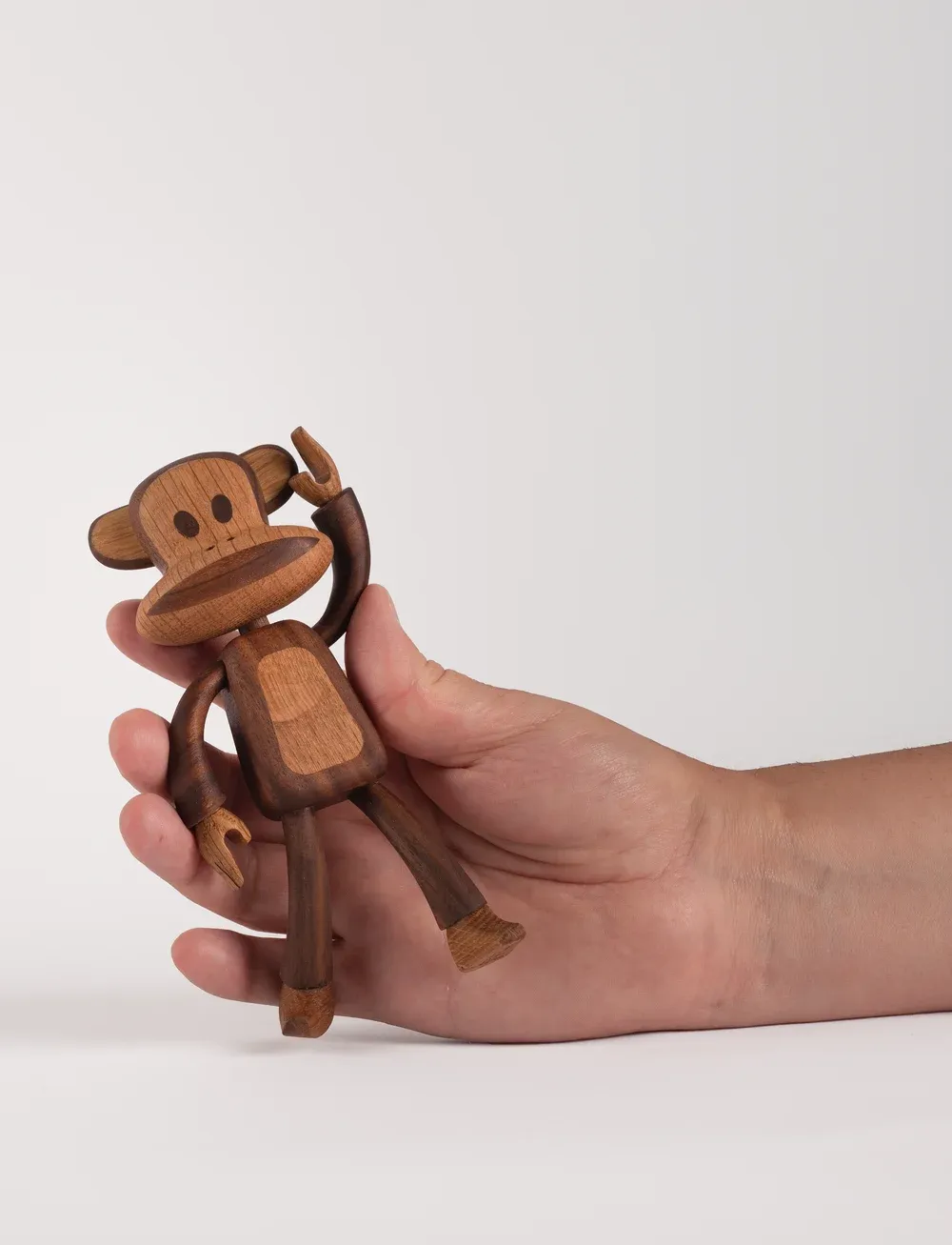
Studio Chan supported the product development of a licensed wooden figurine collection for Boyhood, helping transform beloved 2D characters into market-ready 3D forms.
The project spanned three internationally recognised IPs — Hello Kitty, Moomin and Paul Frank — each with its own visual codes, character proportions and licensing sensitivities. The challenge was to preserve the instant recognisability of each character while adapting them into Boyhood’s world of crafted wooden objects: simplified, tactile, collectible and production-ready.
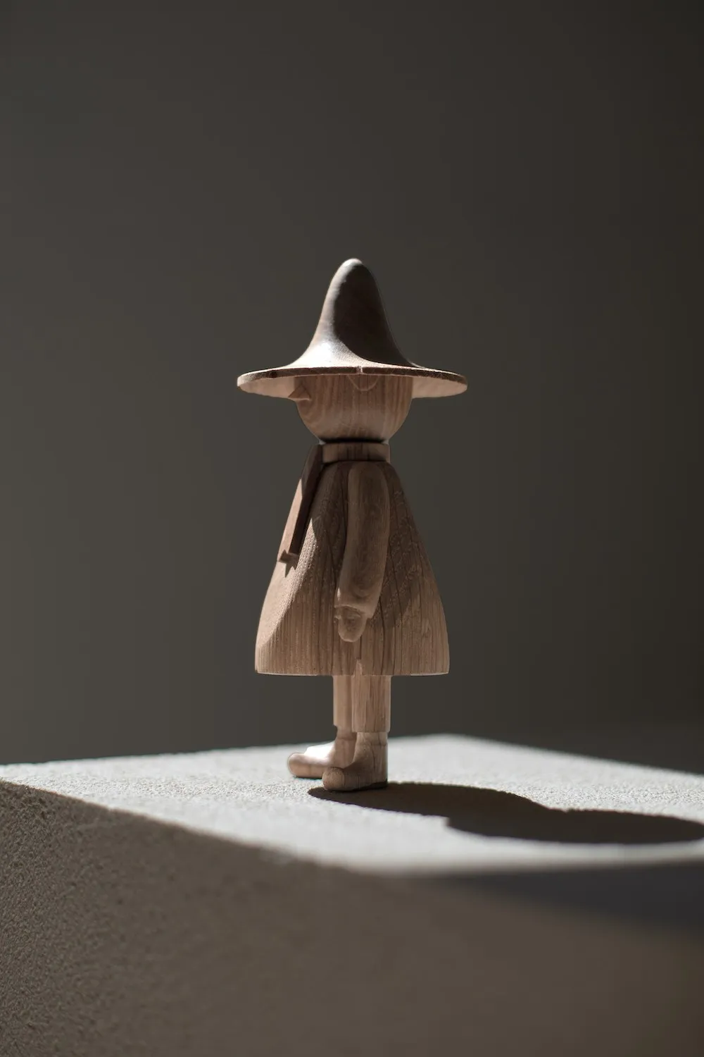
Studio Chan’s role focused on the development stage, taking flat character artwork and resolving it into three-dimensional figurine forms suitable for manufacture. This involved interpreting proportions, refining silhouettes, simplifying details, and considering how each character could be translated through wood without losing personality or brand accuracy.
The work balanced character fidelity with material reality — ensuring the final forms could work as desirable design objects while remaining true to the original licensed IP. Across the range, the development process helped bridge the gap between illustration, collectible design and manufacturable wooden product.
credits
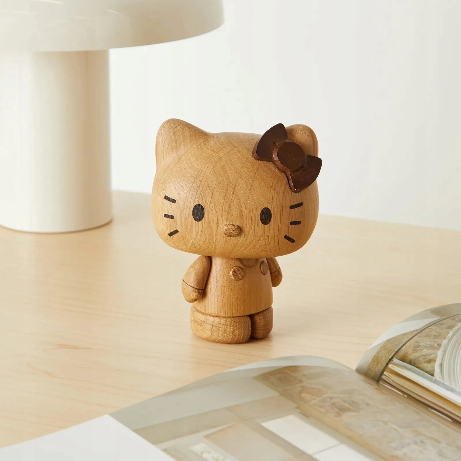
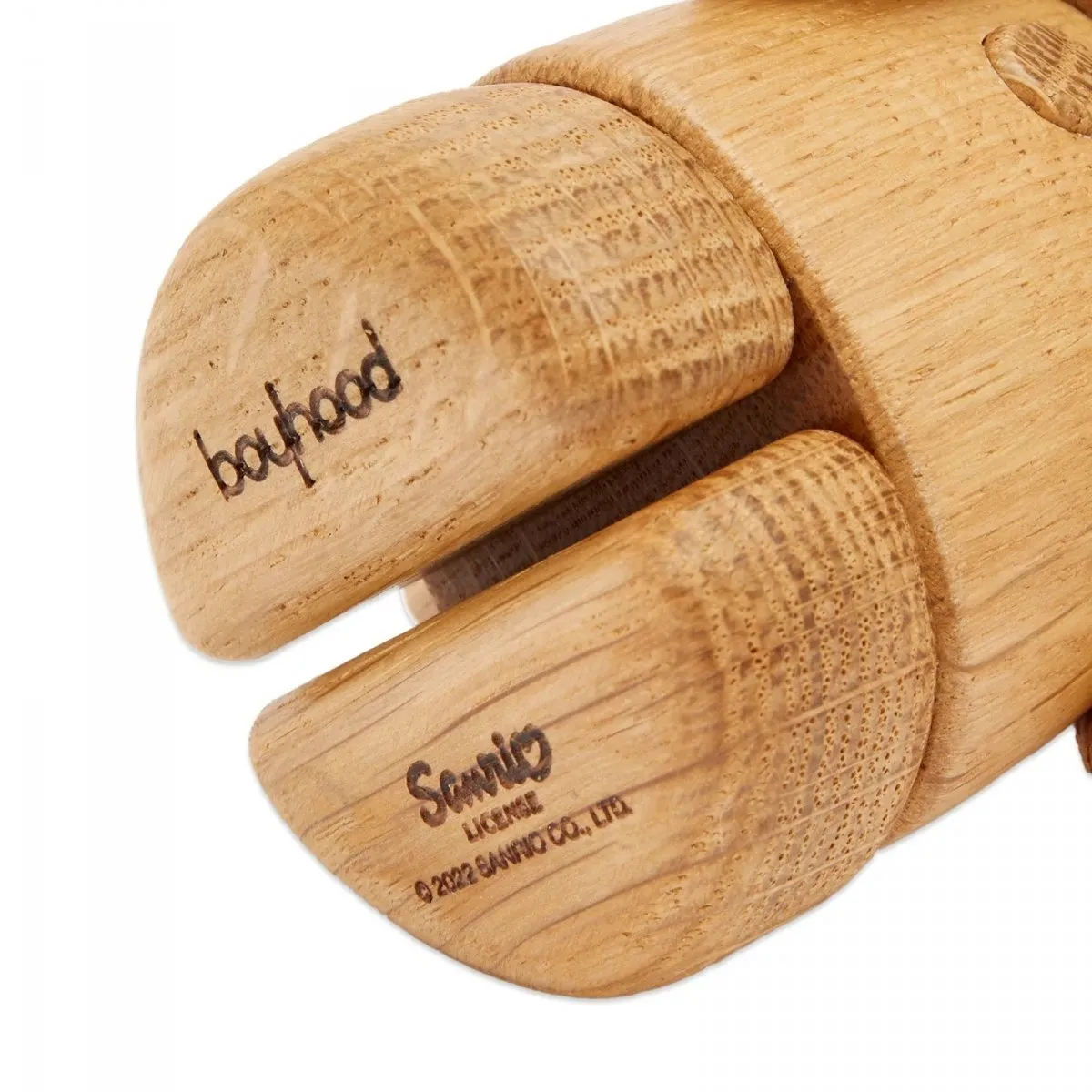
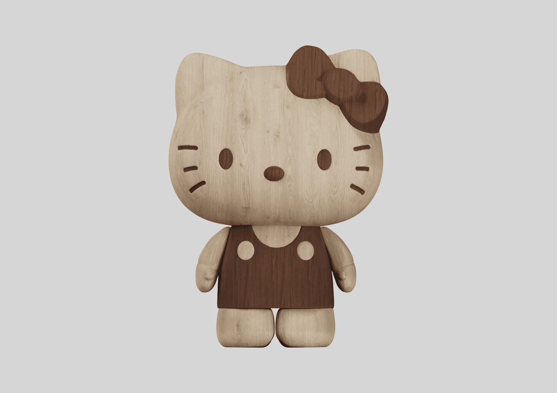
Design for manufacture was a key part of the project. Wooden character figures require a different level of simplification compared with digital artwork or plastic toys, particularly around small features, thin details and areas that are difficult to machine, paint or assemble consistently.
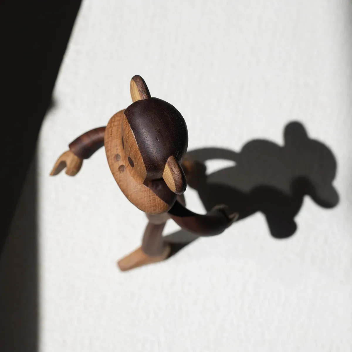
During development, some smaller details created manufacturing challenges. Elements that worked visually in 2D became too fine, fragile or difficult to reproduce accurately at scale. Rather than removing these details completely, Studio Chan worked around the limitations by simplifying forms, exaggerating key silhouettes and shifting certain details into more production-friendly features.
Where possible, fine details were translated into painted graphics, shallow surface changes or slightly enlarged physical forms. This allowed the figures to keep their recognisable character identity without relying on fragile components or overly complex construction.
The final designs balanced brand accuracy, character appeal and factory feasibility, ensuring the IP translated well into 3D while remaining achievable for the chosen production process.
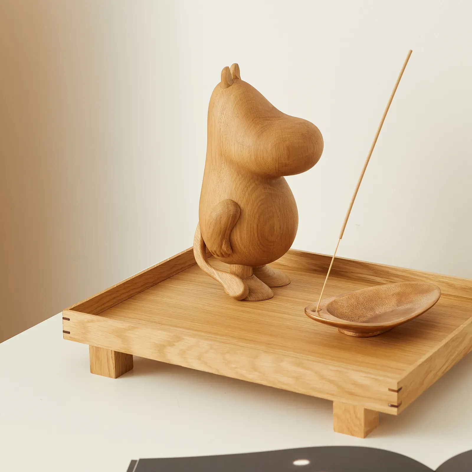
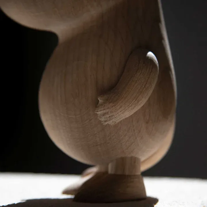
The final figure language balanced recognisable character detail with the practical limitations of timber, tooling and assembly.